Responsive design using Grid and Flexbox
CSS3
HTML5
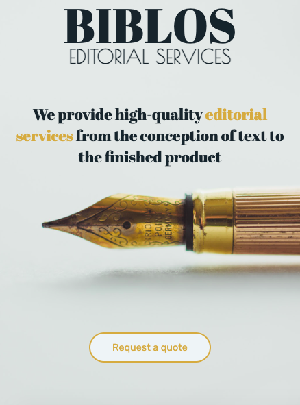
This is an example of a business website that is completely responsive. The website incorporates multiple media queries to optimally display the content independently of screen sizes. The CSS script uses root values for easy customization and it makes use of responsive units (e.g. vh, em, rem, and percentages).
The layout of the independent sections makes use of Flexbox and Grid. For information that is well organized in regular grids, it uses flexbox, for elements to automatically fill that grid. For information that is displayed in irregular grids (e.g., the "projects section") CSS grid is used.
The website also makes heavy use of hover effects to display information effectively, and to indicate to the user visually which elements in the page are interactive.